Enterprise Energy Platform · Koombea · NDA
Making AI work you can trust
A B2B enterprise hub for energy suppliers needed AI-assisted company profile completion. I designed the interaction model that makes the AI's output auditable, so users approve, not just accept.
Weeks of translation work before you could start
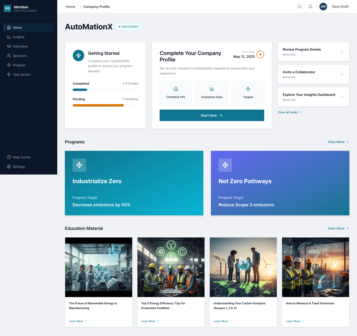
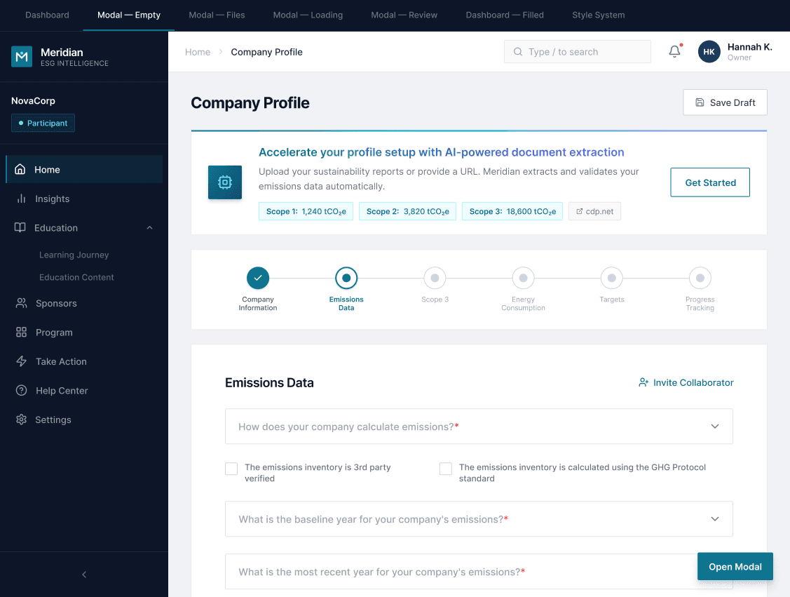
The platform is a B2B enterprise hub for energy suppliers that need to report carbon emissions, follow reduction programs, and keep their company profile up to date. The profile is the prerequisite of activation. Without it, the rest of the platform doesn't unlock.
The existing import flow was the industry standard: download an Excel template, translate your company data into the exact system format, upload without errors. It works when data is already structured that way. In practice, company data arrives in PDFs, presentations, and prior reports in different structures. The user has to do the translation manually. For a 6-section profile with technical data, that took weeks.
The problem wasn't that users didn't want to complete the profile. The problem was that the process demanded work they had no reason to do.
Before
Download Excel template → manually translate company data to match the system's exact format → upload without errors. Weeks of work before the profile was active and the platform unlocked.
After
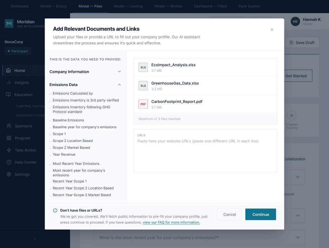
Upload whatever you already have: PDFs, presentations, past reports, web links. The AI reads them, maps the data, and prepares a review. You check the results and confirm.
The profile is the activation gate. Every week of delay is a supplier who can't use anything else on the platform.
JTBD: "When I need to complete my company profile, I want to use information that already exists about my company without having to reformat it manually, so I can activate on the platform without losing weeks."
The PM identified the opportunity correctly: if an AI engine can read what the user already has and map it to the system format, it eliminates the translation work. The direction was "add AI to the import flow." From there, I took ownership of the solution.
Platform context
Profile as prerequisite
The company profile gates everything else. Suppliers can't report emissions, join reduction programs, or interact with buyers until it's complete. Slow activation had real operational impact.
My role
Sole designer, end-to-end
I was the only designer on this project inside Koombea, working directly with the enterprise client. The PM brought the problem and direction. JTBD, technical triangulation with dev, and all interaction and system decisions were mine.
The PM brought the problem. The interaction model, the review layer, the confidence system. Those decisions were mine.
It'snot"theAIimportsforyou."TheAIdoestheprepwork.Youapprove.
Two questions before touching Figma
I started with the JTBD, then asked a technical question that would shape every design decision: what can the AI engine actually do? I triangulated with the dev team to understand three things.
Input formats
What it can read
PDF, PPT, Excel, CSV, and web links. Any combination in a single import session.
Confidence level
How certain it is
The engine can report its confidence per field. It knows when it found something clearly vs. when it's inferring from partial data.
Ambiguity threshold
When to flag vs. autocomplete
High confidence with no conflicts → autocomplete. Source conflict or low confidence → surface for human review.
What got discarded
The team expected a three-step flow: upload documents, AI analyzes, results imported. Direct. I proposed inserting a review screen before execution. The argument was simple: an AI engine makes mistakes, and in corporate emissions data an undetected error has real consequences. Without a review step, the flow is a black box, and the platform loses user trust the first time it gets something wrong.
Three design decisions define how the product feels. Together, they answer the same question: how do you build trust into a flow where an AI is doing work the user can't see?
01 · The human review layer
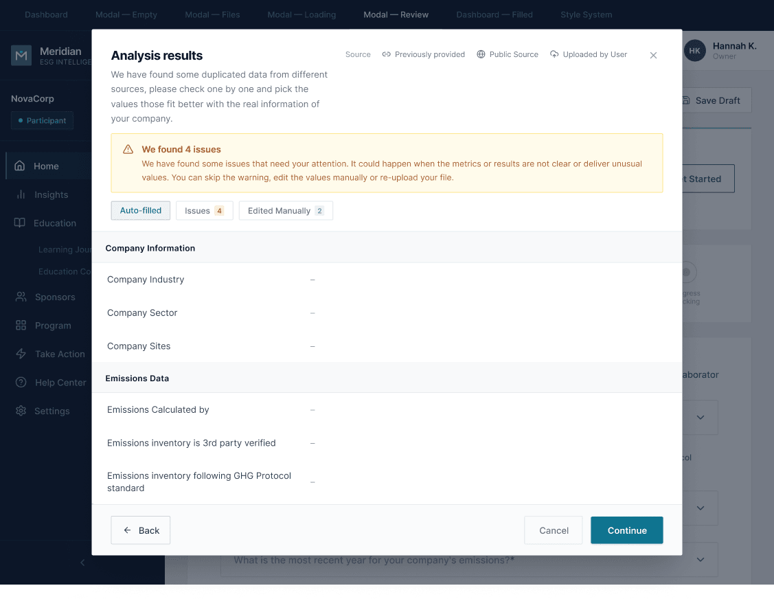
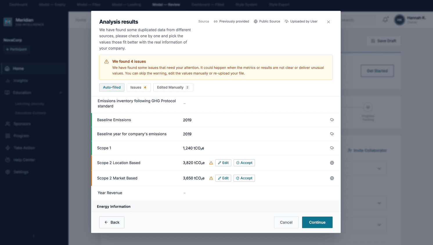
The Review Report is the heart of the flow. Before anything is imported, the user sees exactly what the AI found, organized into three categories: Auto-filled (ready to confirm), Issues (requires a decision), and Edited Manually (fields the user already adjusted). Without this screen, the flow is a black box. With it, the user can triage in seconds, act on what needs attention, and execute with certainty.
This was the most important decision of the project. It defines the product's mental model: the AI prepares the work, and the user approves it. That distinction changes how users relate to errors. They expect to be in the loop, not surprised by them.
02 · The confidence color system
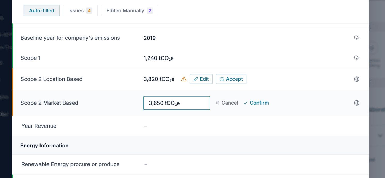
Three visual states for fields in the review: a green left border (confirmed, no conflict between sources), an orange left border (conflict between sources, requires Edit or Accept from the user), and no color (field not found, user completes manually).
The guiding principle: the user should be able to scan the report vertically in seconds. Green means skip. Orange means action required. The color runs down the left edge of each row, visible at a glance without reading any values. Conflicts surface inline with Edit and Accept buttons; no separate screen required.
03 · Source traceability
Every result in the review carries a source tag: Previously provided (data already in the system), Public Source (publicly available information the AI found), or Uploaded by User (pulled from the specific files submitted). The tags appear at the review level, before the user confirms anything.
This matters for enterprise users dealing with compliance data. When a value looks wrong, the source tag tells them immediately where it came from, without leaving the review screen or checking external records. That context is what makes errors recoverable without breaking trust in the system.
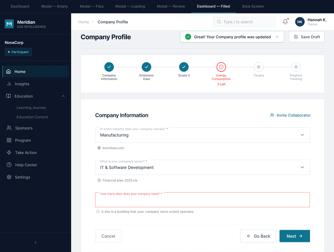
Approved by stakeholders, queued for production
The flow was approved by stakeholders and placed on the roadmap for production. It hasn't reached real users yet, so there are no production metrics.
The approval came with a clear signal that the direction resonated, not just with usability but with how the product team imagined the feature working when they originally raised the spec.
"Amazing, this will work better than we imagined when we raised the spec." — PM stakeholder
Designer's note
I designed the full Review Report interaction without being able to test it with real users before stakeholder approval. It worked because I triangulated well with dev and worked from the JTBD, but there's something I'd do differently.
The confidence color system assumes that yellow reads as "conflict that requires action," not as "serious warning." That assumption is still an untested hypothesis. Depending on the user's context — a supplier who is stressed about a compliance deadline vs. one doing routine maintenance — yellow might land very differently.
If I were doing this again, I'd want at least one quick testing session with the Review Report before the stakeholder presentation, specifically to validate whether the color system communicates urgency without triggering anxiety. That's the one open question this project left behind.