Koombea · B2B Enterprise · NDA
The Homepage That Left Enterprise Users Paralyzed
How I designed a two-round research cycle — without direct user access — to fix an activation problem before it shipped in v2.
Before redesigning anything, I had to solve a different problem: how do you run user research when you can't be in the room?
The answer was to design the instrument. Sessions would be run by the PM and the client team. My job was to write a script precise enough that I could synthesize the recordings without having attended.
When you can't be in the room, the instrument is the design.
"Please take a moment to look around without clicking anything. Feel free to scroll. As you do, talk me through what you notice, what you think this product is for, and what stands out to you."
- What do you think this product is for?
- What's the first thing you'd click?
- What, if anything, is confusing?
"You want to understand why your company has been asked to engage and what the sponsor needs and expects from you."
"Please show me the first steps you are likely to take now you have access to the product and how do you think this contributes to the sponsor's request."
- Where would you start?
- How does this connect to what the sponsor asked for?
"Please submit a company survey and explain what you are required to do next."
The script is the instrument. Its quality determined the quality of everything that followed.
The AI-assisted synthesis turned session recordings into structured clusters. What follows is what surfaced.
"Users feel overwhelmed by competing interface elements and lack clear direction on what actions to take first."
- Homepage presents too many elements without a clear entry point
- Users scan for what to do first, not what the product is
- Competing visual weights prevent focus on primary action
- Multiple users gravitated to the task list without prompting
- Deadline visibility was the first thing users mentioned positively
- Task-based navigation feels familiar and actionable
- Maturity score is perceived as a judgment, not a guide
- Users don't understand what changing the score requires
- Language around "beginner" triggers resistance
- Primary CTAs don't differentiate between urgent and optional tasks
- Users expect a "start here" moment that the homepage doesn't provide
- Notification center draws attention but doesn't direct action
I synthesized sessions I didn't attend. This is what surfaced from recordings the PM documented.
In Round 1, the script worked. We found the problem: not a usability problem, a hierarchy problem.
Three observers watched the same sessions independently. Before synthesis, the pattern was already visible.
3 observers, independent notes, same session. The pattern was consistent before synthesis.
One observer note reframed everything.
"He doesn't know exactly what he is doing in the app. What should be the user goal here. Despite he knows the purpose of the product."
— Cristhian, Round 1 observer note
This note reframed the problem. The user wasn't confused about what the platform was for. He was confused about what to do next. That's not a content problem. It's a hierarchy problem.
The full synthesis produced 9 insights. Three drove the redesign directly.
on the Maturity section
Insights were synthesized from observer notes across Round 1 sessions. Orange = directly mapped to a design bet.
We didn't redesign the homepage. We built three hypotheses and designed to test them.
Each bet was derived from the actions document, which was derived from the insights. Nothing was instinctive.
- Define two primary sections on the homepage
- Deprioritize everything that isn't a primary CTA
- Remove visual competition between sidebar and main content
- Replace "maturity score" framing with stage-based progress language
- Anchor the concept to actions, not identity
- Test alternative labels with R2 participants
- Move the to-do list to the top of the homepage
- Surface due dates at first scan
- Make the next required action the most visible element
Each bet maps to one or more insights from Round 1 synthesis. The actions document was the bridge.
Structure before UI. The wireframe was the decision.
Wireframe con callouts de los 3 bets.
Requiere versión whitelabel del wireframe.
Bet 1: estructura de 2 zonas · Bet 2: To-Do arriba · Bet 3: Maturity como progreso
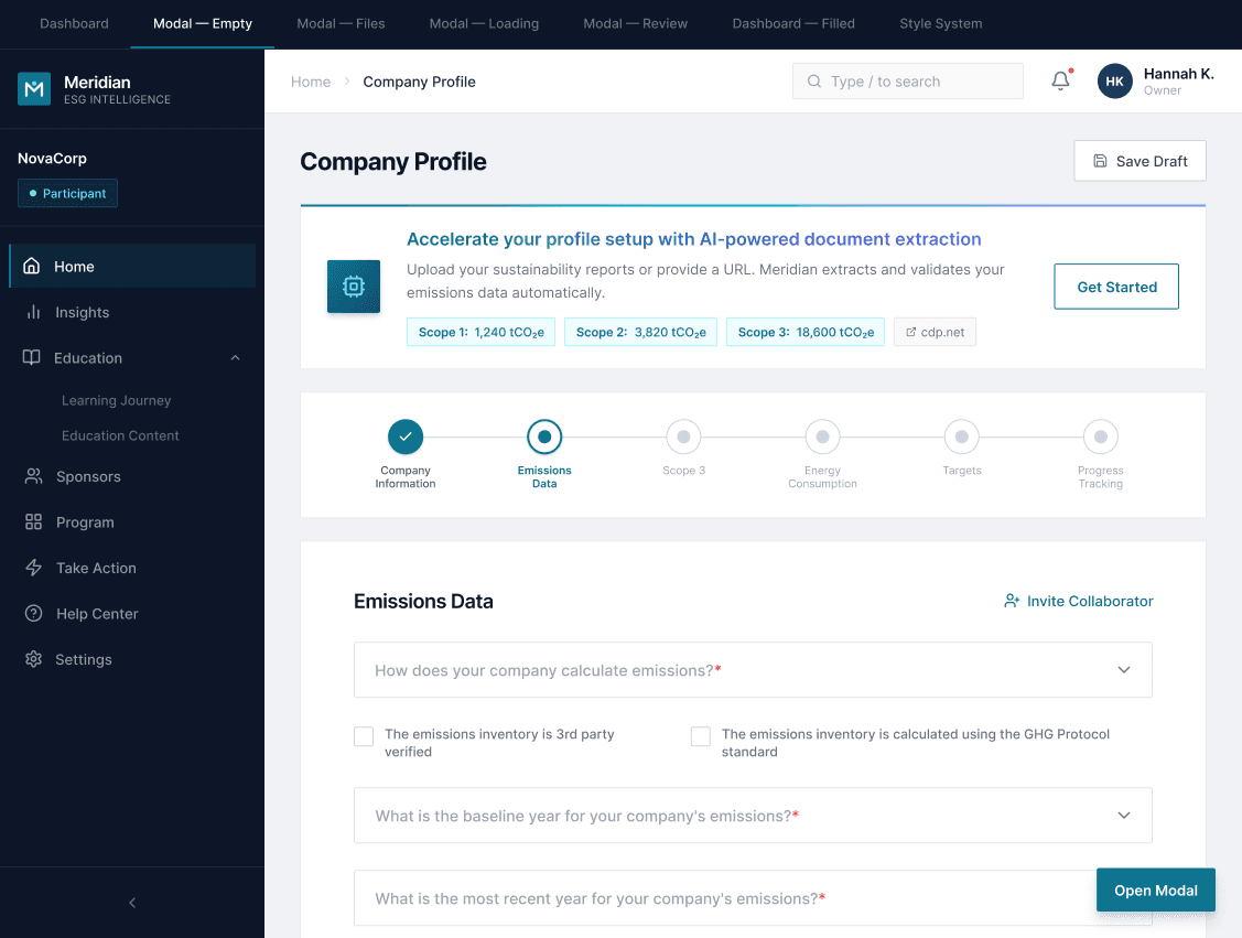
The delta between v1 and the redesign wasn't visual. It was architectural.
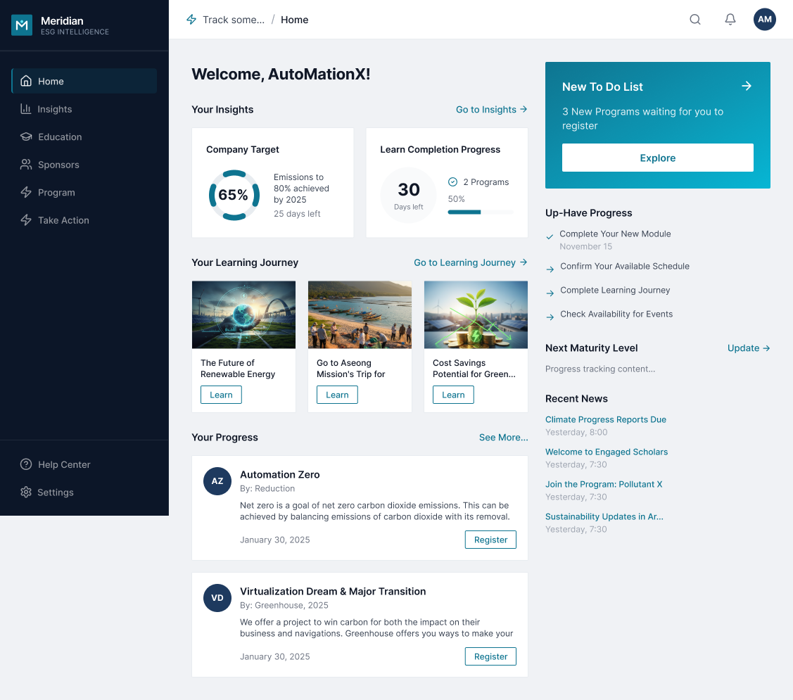
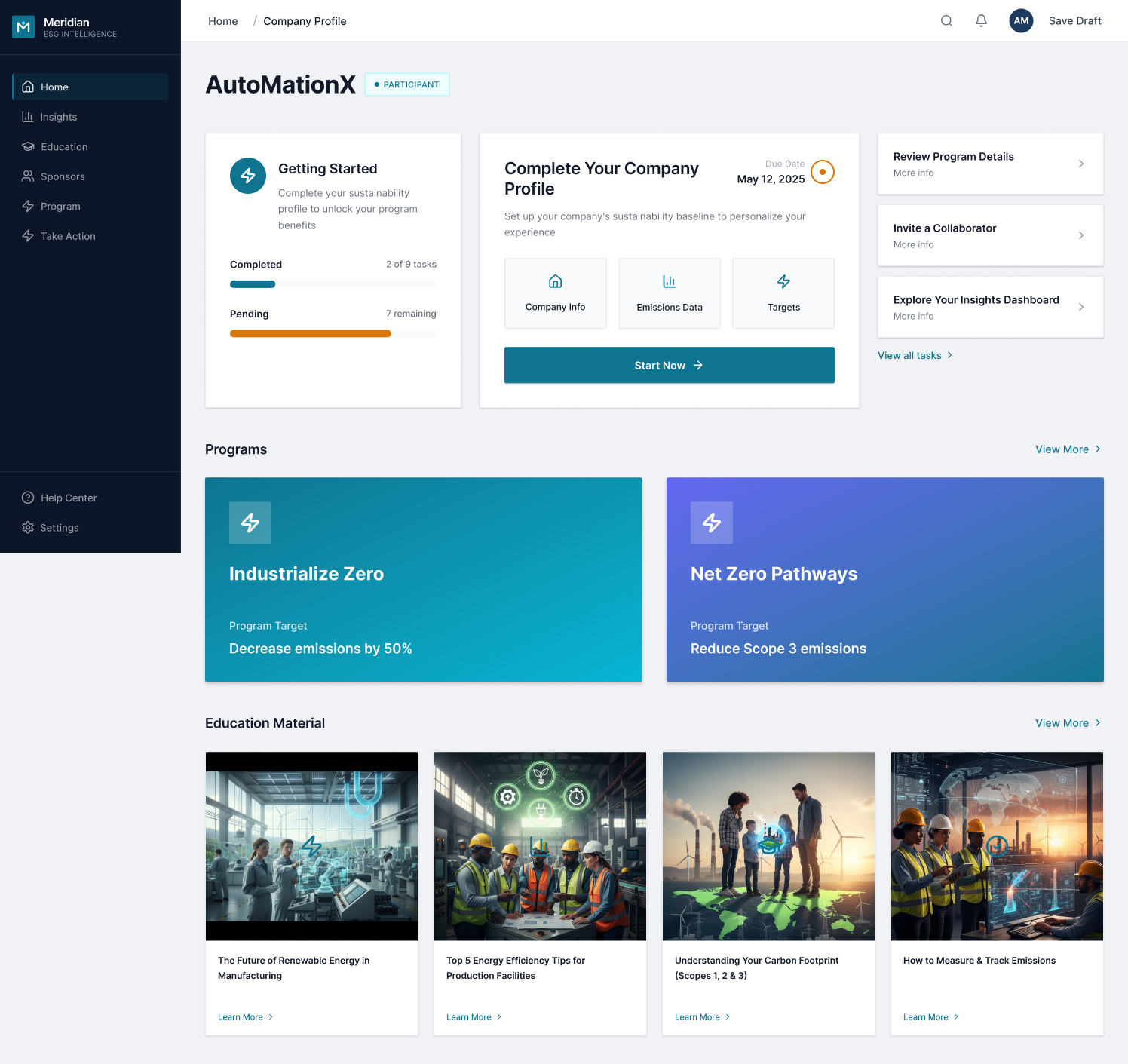
Same platform. Different assumption about what the homepage is for.
Webuiltthreehypothesesanddesignedtotestthem.
Round 2 was designed to validate the three bets, and to document what didn't work with the same rigor.
The script evolved because the diagnosis evolved. R1 asked what users noticed. R2 asked what they would do.
"Please take a moment to look around without clicking anything. Talk me through what you notice, what you think this product is for."
Passive observation. We were listening, not directing.
"Please show me the first steps you are likely to take now you have access to the product."
Active navigation. We were watching decisions, not descriptions.
R1 asked what users noticed. R2 asked what they would do. Same instrument, different question.
Three users, unprompted. What they said, in their own words, in real time.
None of these users were asked about the To-Do. They found it. That's the test.
Open variable: was it the redesign or the onboarding popups? Documented as a confound, not dismissed.
The honest close: what we confirmed, and what remained open.
"Users understood the layout but struggled with task completion tracking and unclear connections between interface elements."
- Top-to-bottom reading pattern worked well
- Outstanding tasks section effectively drew attention with blue deadlines
- Two-section structure felt clear and uncluttered
- Progress counter didn't update after task completion
- Connection between completing a task and overall progress wasn't visible
- All 3 users struggled to interpret the maturity concept
- Stage language helped but didn't fully resolve the confusion
- Maturity score meaning unclear to all users
- Progress counter didn't update after task completion
- Maturity concept needs a product strategy conversation before a design solution
January → March. Same synthesis format. The findings shifted from orientation to execution.
After two rounds, the structure was validated. Here's what it became.
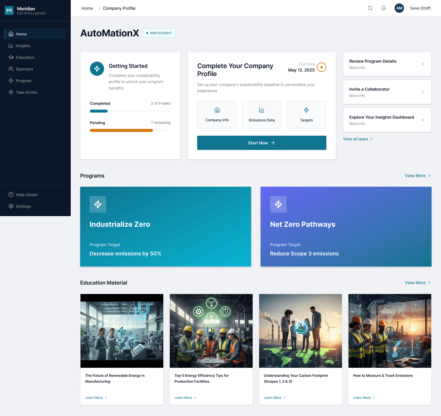
The redesigned homepage. To-Do anchors the top. Two primary CTAs. In Round 2, all 3 users navigated to the task list first, without being asked.
One thing I'd redo
Three users was a project constraint, not a methodological choice I'd defend. With more time, minimum 5 per round.
The Maturity concept needed a product strategy conversation before entering design. We spent cycles on execution of a question that wasn't answered at a business level.
Designing a research process someone else runs is its own skill. The quality of the script determined the quality of everything that followed.